In our previous blog post, we looked at a range of techniques used by phishing kits to evade detection, implemented by a then-recent instance of the NakedPages AiTM phishing kit. Here, we’ll take a closer look at some of the more interesting techniques used by current phishing kits to break common login page detection signatures.
In our previous blog post, we looked at a range of techniques used by phishing kits to evade detection, implemented by a then-recent instance of the NakedPages AiTM phishing kit. Here, we’ll take a closer look at some of the more interesting techniques used by current phishing kits to break common login page detection signatures.
Picking up where we left off...
In our previous blog post, we looked at a range of techniques implemented by a then-recent instance of the NakedPages AiTM phishing kit for evading detection. The techniques covered previously were mostly intended to make two detection strategies for defenders much more difficult:
Writing toolkit signatures: Through heavy use of randomization, constantly changing hosting domains/IPs, legitimate hosting options etc., it becomes very difficult for defenders to maintain effective signatures to detect either generic phishing kit code or where they are hosted.
Automating dynamic analysis: Similarly to sandbox evasion for malware, phishing kits are designed to evade automated discovery and analysis, e.g. by using Cloudflare Turnstile bot detection, and requiring legitimate browser interaction and JavaScript execution in order for execution flow to reach the malicious phishing functionality.
In this blog post, we're diving deeper into a specific category of signature-based detection and how attackers are getting around them: Login page signatures.
Login page signatures 101
The overwhelming majority of common AiTM phishing kits in the wild now are targeting the most dominant identity providers (IdPs), such as Microsoft Entra or Google Workspace. They typically emulate the login pages of these platforms to ensure the victim uses the correct password and MFA factor and completes the login process, so the attacker can steal the valid session.
As a result, security product vendors are naturally looking to move away from unreliable detections based on signaturing ever-changing phishing kits, toward detecting login pages that look like Microsoft Entra, Google Workspace (or any other common IdP) but are not hosted on the official domains. The benefit here is that you’re focusing on a fixed, known target, rather than a constantly moving one (e.g. phishing kit codebases).
However, attackers have managed to stay one step ahead and are already using a wide range of techniques to break these detections and counter the countermeasures.
Signature evasion strategies
Well, like most good ideas, someone else has already had it — many phishing kits pre-emptively take steps to evade detections based on login page signatures. The specific evasion techniques used are a useful insight into what detection techniques are out there and are needing to be circumvented.
Before we delve into the specific examples, let’s first consider the general strategies for this: document object model (DOM) obfuscation, and visual obfuscation.
DOM obfuscation
This is the more traditional evasion approach. The goal for an attacker is to have a login page that is visually identical to the real page when viewed with the human eye.
But that doesn’t mean the underlying DOM (or loaded HTML, CSS, and JS code) needs to be the same, or even similar, to the real login page. It’s possible to construct a completely different DOM that ensures the same visual output with a very different underlying code.
It’s also possible to use dynamic modification techniques to ensure the DOM changes during execution to frustrate fixed point-in-time analysis controls, like those that may be used by web proxies.
Visual obfuscation
With the ever-increasing capabilities of machine learning (ML) and other artificial intelligence (AI) technologies, we don’t just have to look at the underlying code and text signatures anymore. There are a range of computer vision based techniques that can be used to simulate a more human approach to assessing if a login page matches another example.
Therefore, another approach to defeat login page signatures would be to perform visual obfuscation techniques that can frustrate computer vision-based detections, while still fooling a human user.
DOM obfuscation techniques
For consistency, we’re going to focus on Microsoft login phishing kits as they are the most common (by far), but we’ll pick from some different samples we’ve observed. Let’s start with a few examples of DOM obfuscation we have seen in the wild:
#1 – DOM structure change
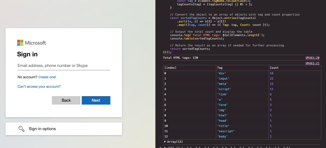
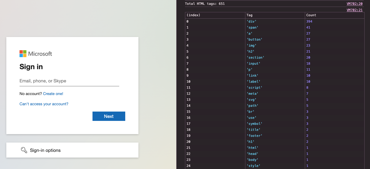
If an attacker were to simply clone Microsoft’s login page, then we’d expect to see a very similar (if not identical) DOM structure, right? After all, the simplest way to emulate a web page visually is either to copy the HTML directly or transparently proxy requests to the real target with minimal changes, as tools like Evilginx do. This would make detection far simpler as we’d have a known code structure to look for.
Unfortunately, it’s pretty common for attackers to deliberately use a completely different DOM structure for something that’s almost identical to the eye. It takes a lot more effort to implement this and so the reason for it is almost certainly to avoid this detection technique.
Check out the examples below to see a high-level interpretation of the DOM structure for a legitimate Microsoft login page and one phishing example. You can see how they are visually very similar, but radically different from one another when looking at DOM code:
#2 – Randomizing page titles
The HTML page title is one very specific place to check for similarity. For Microsoft, it can change slightly depending on the service, but if we use Outlook as an example then the page title is “Sign in to Outlook”. This also has a favicon of the Microsoft logo (another issue we’ll visit later in the article). It’s unsurprising that attackers are randomizing the page title to evade basic detections – how many users would really notice any difference?
Some kits, such as the NakedPages case study we looked at in the previous article, use purely randomized alphanumeric text. Others use english words that may seem innocuous if a user does inspect them, but are in fact randomized between iterations to ensure any one set that is flagged will not completely block the phishing kit from operating.
For example, see three refreshed examples of the same phishing kit below when compared with the legitimate Outlook login page title next to it.

#3 – Desktop control techniques (e.g. NoVNC)
The most common AiTM phishing technique is some form of a web proxy method, where the victim interacts with a legitimate website that is proxying certain requests to the real backend. However, this is not the only method. Some tools utilize a Browser-in-the-Middle (BiTM) technique that involves using desktop sharing technologies to remotely control an attacker’s browser instead.
If you want to know more about this, check out our previous article on AiTM phishing.
The upside of this for an attacker is that the website is actually completely different from the target website under the hood. If anything, it just looks like any other website making use of similar technologies like NoVNC.
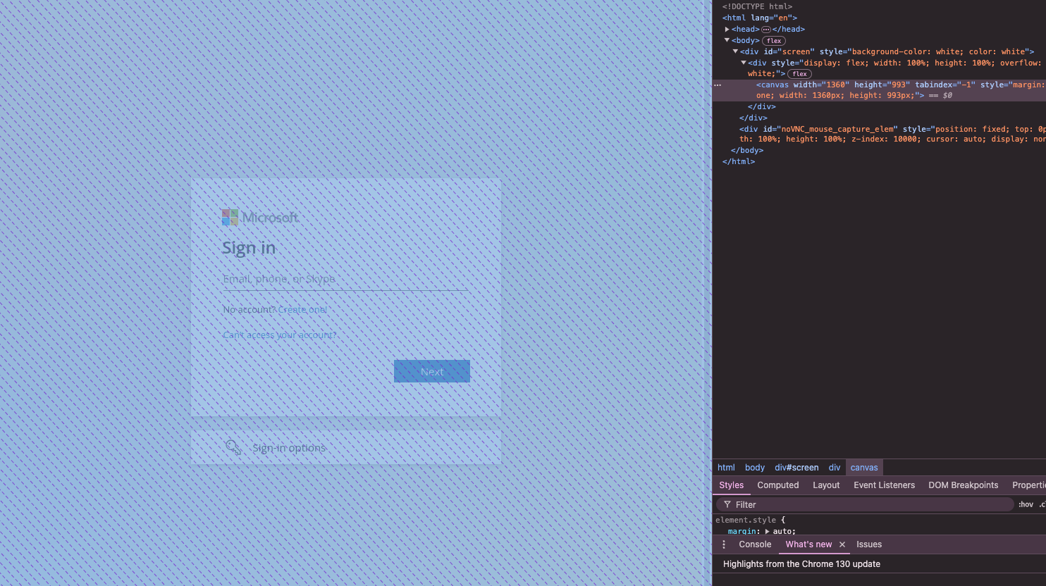
For example, see the following screenshot example of using the open-source BiTM tool, EvilNoVNC. You can see how the underlying HTML and DOM are completely different due to the use of this technique, with effectively the entire page just being an HTML canvas element that is rendered like a video.
#4 – Dynamic text decoding
Sometimes there may be very specific strings that detection tools might try to signature on. Let’s use the example of text that appears visually on the login page. While most login text can be pretty generic, e.g. “Sign in”, that’s not always the case. To appear authentic, it’s better for an attacker to keep it the same, but that leaves it vulnerable to signature detection.
For example, the placeholder text on Microsoft’s login page is “Email, phone, or Skype”. Particularly given Microsoft’s historical acquisition of Skype, this is actually a pretty specific piece of text that you won’t usually find in the username field of a login page very often.
So how do you keep this text but make it harder to signature on? Well you fall back to classic decoding techniques to avoid static signatures. In this case, that is decoded from base64 using JavaScript’s atob() function in order to load that text dynamically during execution rather than have it statically within the HTML. This makes it harder to create a signature using common point-in-time static analysis techniques.

#5 – Image element obfuscation
We’re starting to shift towards more visual-based obfuscation elements now, but first let’s cover an interesting example that straddles the two.
Many login pages will have very clear examples of vendor logos present in specific locations and elements as part of a login page. This is a huge part of an authentic visual experience and so attackers would like to keep them there. However, as defenders we could specifically look for these elements, both for pure structural matching techniques or as a pre-processing step for visual matching techniques later (e.g. visually matching a logo, rather than the entire page).
For this reason, attackers might want to obfuscate this aspect in order to make it difficult to match or locate the images used within the login page, while still ensuring they appear visually identical to a user.
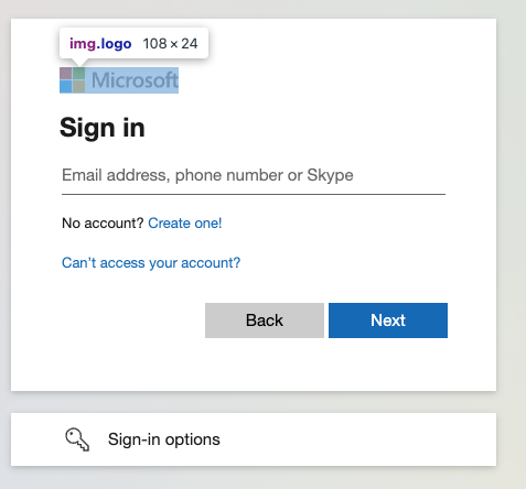
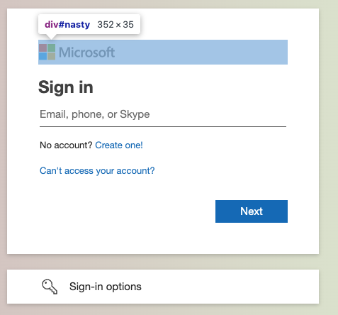
Below, we can see a comparison of a legitimate Microsoft login page and a phishing kit. You can see how in the original a standard HTML <img> element of a specific size and name are used. In comparison, our phishing kit has replaced this with a <div> element of a different size and made use of background image styling to ensure the <div> ends up with the same visual appearance despite the structural differences.
Visual obfuscation techniques
As if that wasn’t enough, let’s move on to some visual obfuscation techniques that attackers are also using.
#6 – Favicon changes
We effectively saw this earlier when speaking about HTML page title randomization. The favicon is also an easy place to look for the obvious use of vendor logos. How many legitimate websites are going to have the Microsoft logo as their favicon? If they do, they may quickly end up with a cease and desist letter!
Favicons also render at a fixed size, so if an attacker wants to ensure that the Microsoft logo appears as the favicon for their page, it gives defenders a fixed target to perform image recognition against for cloned logos.
In this phishing kit example, it looks like the authors have decided they are better off just leaving the favicon empty to avoid being vulnerable to this detection technique.

#7 – Blurred background images
Ok, this is a pretty clever one. Let’s say as a defender we wanted to perform sophisticated image recognition techniques to detect websites that look visually very similar to Microsoft’s login page overall. There may be many challenges around rendering resolution etc to deal with but conceptually we could look to match on the whole page.
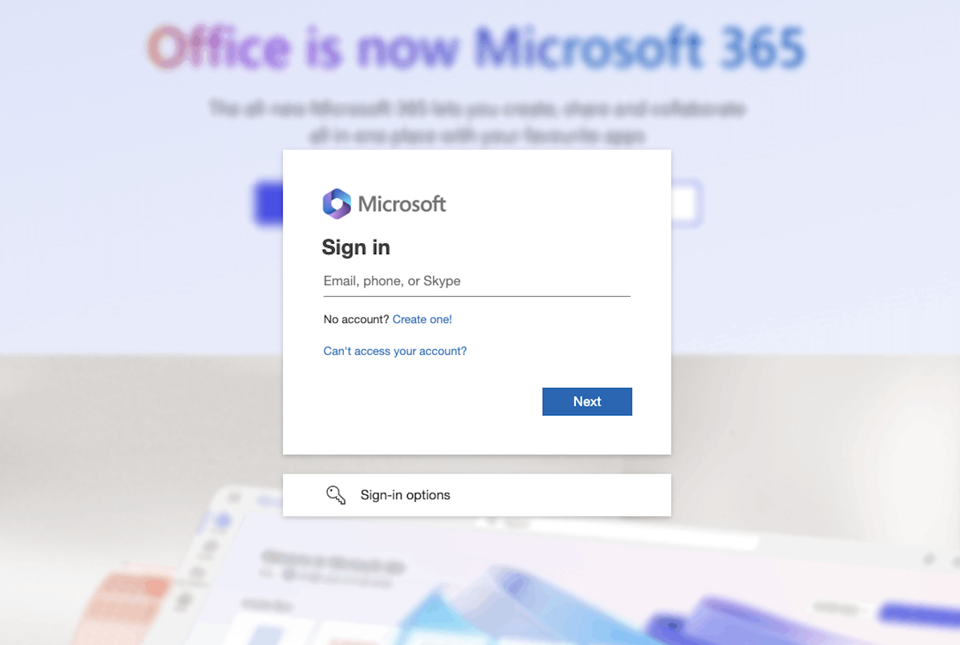
However, if an attacker makes a substantial visual change to the page that still appears authentic then this would prevent the technique from operating effectively. One common graphic design method used when a modal pops up is to blur the background. Some phishing kits use similar techniques on their login pages with a variety of different background images that are derived from legitimate Microsoft sources.
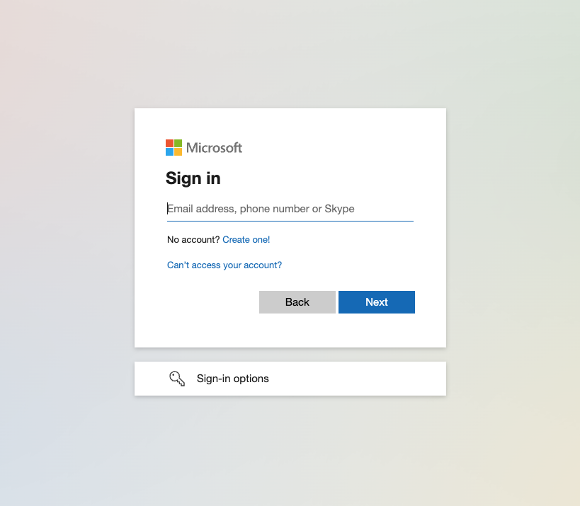
The first time you see this, it’s easy to think you’ve seen this a hundred times before. It just seems very familiar and authentic… except it’s not. The real login page has a blank background. Therefore, any algorithms looking for visual similarity of the overall page are not going to match because they are actually radically different.
This is a trick on the human brain and the way we interpret images, not a trick on a computer vision algorithm. Take a look at the phishing example and the real Microsoft login page below:
#8 – Logo substitution
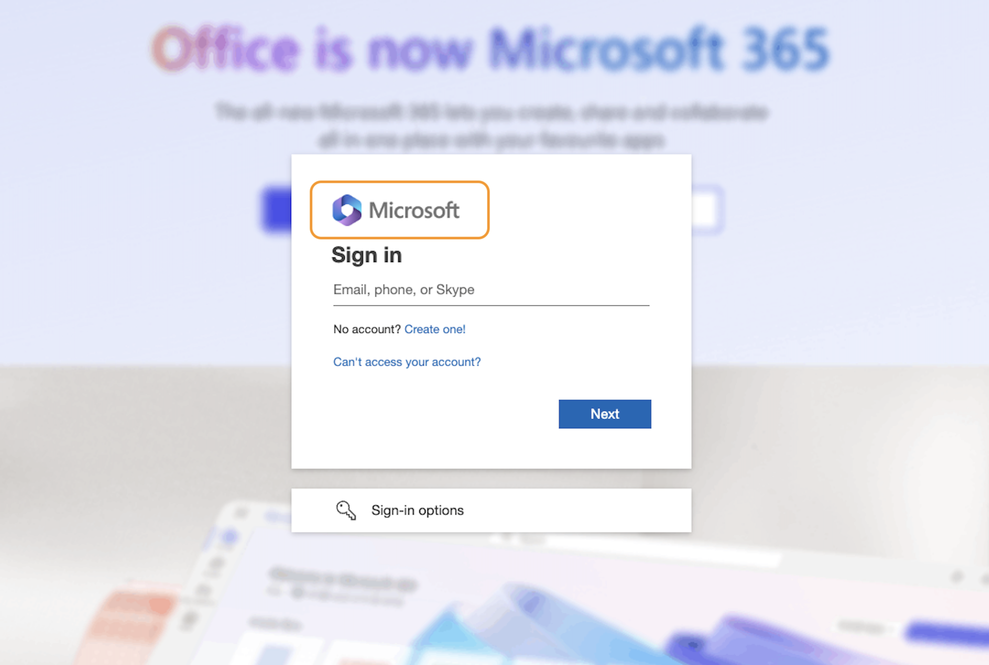
You might have noticed one other change with the previous image – the logo that was used. We saw earlier how some phishing kits make it harder to identify individual logos within an image through DOM obfuscation techniques. However, the other approach is to substitute logos for similar ones that give a sense of authenticity to the user but are visually completely different.
In this case, the phishing kit has chosen to use the newer purple hexagon Microsoft 365 logo in place of the standard Microsoft logo on the login page. Users will no doubt be familiar with this logo as belonging to Microsoft and so it still gives the sense of authenticity. A computer vision algorithm looking to match the original logo won’t know that though!
#9 - Sub-image obfuscation
Ok, so let’s say an attacker wants to use the real logo and they’ve even used the image element obfuscation method we saw earlier to dynamically set the image as a background image for a <div> element.
However, it’s not impossible for these images to be isolated and analyzed. Perhaps a defender might enumerate all divs, compute the background images and analyze them all. We can see an example of using code to do this to determine the image used by a <div> element in a phishing kit below:

This gives us the base64 image data that was set as the background image. However, if we look at that image data directly we see it’s an obfuscated form of the image, even though it displays correctly when properly cropped as it’s embedded in the overall page:

This makes it harder for a visual algorithm to match the logo as it’s clearly not exactly the same. Instead, careful construction of the div and related DOM has ensured that these obfuscated edge pieces do not show visually to the user.
Conclusion
In our previous article, we looked at a higher level set of techniques used by phishing kits to avoid detection. In this article, we’ve dived deeper into one particular strategy of breaking login page signatures and have shown how, even inside of this one strategy, there are many different sub-techniques being used to evade common detections.
Looking at the evasion techniques discussed here and in Part 1, it’s pretty clear that attackers are consciously looking to bypass automated detection techniques typically implemented through either web traffic analysis (using a web proxy inspection tool or Secure Web Gateway) or website sandboxing (for example link analysis provided by an email security appliance).
On a positive note, this shows us that (at least some) detection tools are trending upwards on the Pyramid of Pain — moving away from nearly pointless signatures like IP addresses and domains towards more in-depth detections of specific tool techniques. Though it’s also fair to say that, in this cat-and-mouse game, it seems the attackers are maintaining the advantage. This may be because these detection technologies are widely available, and attackers can test their kits against these tools and change them just enough to bypass them.
If you’re interested in how Push is able to detect these attacks despite all these ever evolving evasion techniques by using browser telemetry and evaluating user interaction with these kits — take a look at how we do phishing detection.


